Fall of Zoryas
Since 2024

Dev-friendly. Design systems enthusiast. Data-driven decision maker. Based at Buenos Aires, Argentina.
I design scalable digital products that connect business strategy with meaningful user experiences.
I’ve helped fintech companies and global organizations transform complex challenges into intuitive digital experiences. My work spans the entire product lifecycle, from discovery and strategy to design systems and governance, always balancing user needs, technical constraints, and business objectives.
I believe the best products emerge where systems thinking, collaboration, and data-informed decisions come together. Whether launching something new or evolving an established ecosystem, my focus remains the same: creating experiences that are intuitive for users, scalable for teams, and impactful for businesses.

Brands with I been work
Since 2024
01 — The World & The Challenge
Fall of Zoryas is an experimental dark fantasy project that weaves multiple character-driven narratives into a single, meticulously built world.
The challenge was structural rather than aesthetic: blend experience design, deep narrative architecture and AI-generated visuals into something that reads as one coherent, emotionally immersive whole, not as three separate crafts sharing a title.
It explores transformation, power and legacy through dynamic character arcs and an interconnected lore, where mystical forces, cultural identity and internal conflict converge.

02 — Role & Contribution
As Book Writer I hold the narrative architecture: character arcs, timelines and the internal logic that keeps Solvarea consistent as it grows.
As Art Director I define the visual language, from character silhouettes to cartography, and keep every generated image accountable to the lore rather than the other way around.
03 — Key Design Decisions
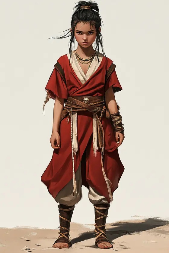
Each character carries two things at once: their personal evolution and the cultural roots of their homeland, from sacred cities to untamed frontiers.
The visual language draws on distinct landscapes, traditional symbols and attire, binding character, culture and environment together.
03 — Key Design Decisions
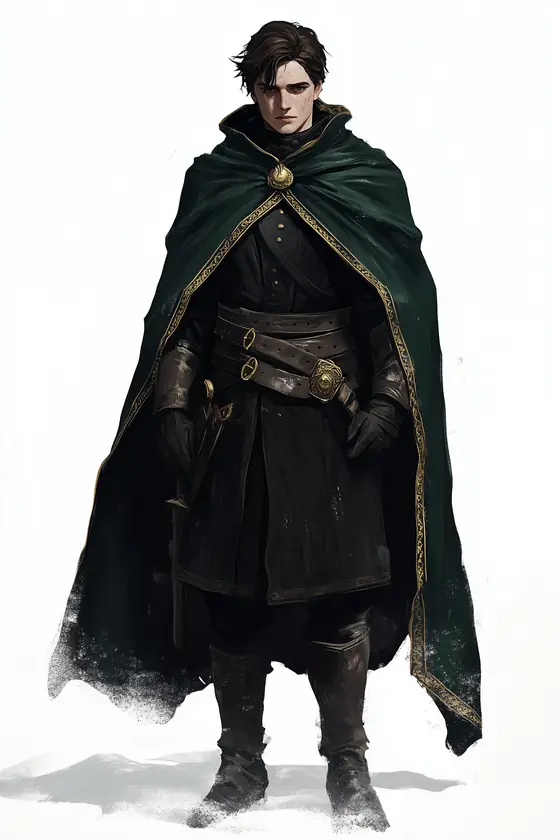
Every story arc adds cultural nuance and emotional weight to the broader narrative of Solvarea. The central decision was to intertwine personal transformation with collective myth, so the setting reads as alive rather than as a backdrop.
Architecture, ornament and language all feed the same goal: making the world feel inhabited rather than described.
04 — The Outcome
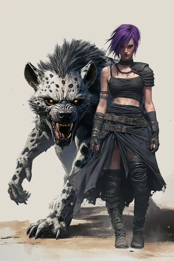
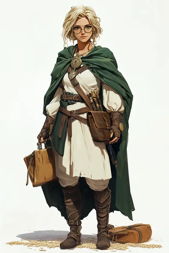
What began as a worldbuilding exercise became a layered saga with its own cartography, cultural systems and cast. A body of work where readers uncover mysteries, confront legacy, and navigate a world that feels both fantastical and eerily familiar.
The project is still in progress. The next chapter is turning the lore into something readable outside my own notes.
2022 to 2023

01 — Product & Problem
As PersonalPay scaled, design inconsistencies, accessibility gaps and slow design-development handoffs started holding releases back.
Product teams were using disparate UI patterns, which produced incoherent experiences across platforms. Engineers spent valuable time recreating interface from scratch.
The absence of a unified approach reduced scalability and pushed engineering overhead up release after release.

02 — Role & Contribution
I led the creation of Fractal, a modular and scalable design system built to bring visual and functional consistency across the ecosystem.

03 — Key Design Decisions
The strategy focused on three fronts: improving accessibility, removing redundancies, and aligning design and development through shared standards.
Rather than freezing a snapshot of the product, Fractal was designed to grow with it: standardised tokens, a documented contribution model, and components prioritised by real usage data instead of by what was easiest to abstract.

04 — The Outcome
Design-development handoff dropped by 40%, accelerating product cycles across the board.
Consistency improved on every platform, producing a more intuitive and unified experience. Designers moved from recreating UI components to working on strategic UX, and the system scales with PersonalPay, enabling faster iteration on future features.

2026

01 — The Problem
BGC had grown into a large digital ecosystem for Google's business and advertising products, consolidated around Plexi, a shared design system that let teams ship consistently and at scale.
But that consolidation prioritised speed over rethinking the experience end to end. Across dozens of pages, repeated patterns had piled up alongside one-off solutions, visual inconsistencies and UX gaps.
It worked. It just didn't feel like one cohesive Google experience.


02 — My Role
I was responsible for coherence: making sure design decisions weren't solving for a single page, but contributing to a system that could scale across the ecosystem.
That meant setting design direction, approving design decisions, guiding system-level explorations, and partnering with engineering through implementation to protect the intent of the work.
The goal wasn't to make BGC look newer, but to build a future-ready experience that helps users understand and connect with Google's products.


03 — Key Design Decisions
Our audit revealed that just 10 core modules accounted for 88% of usage across the site.
That concentration showed us where system-level improvements could have the greatest impact. Rather than redesigning every page or rebuilding Plexi from scratch, we focused on evolving the foundations, components and patterns that powered most of the experience.
The goal was to make targeted improvements that could scale across the ecosystem.

03 — Key Design Decisions
Our north star was an experience that felt playful, expressive, scalable and intelligent without sacrificing clarity, consistency or usability.
Expression couldn't become decoration for its own sake. It had to strengthen hierarchy, storytelling and engagement while still behaving predictably as part of a system.
Consistency had given BGC scale. Expression would give it identity.

03 — Key Design Decisions
A modular system makes experiences consistent, but it can also make pages feel like a sequence of interchangeable blocks.
We shifted the question from which modules go on this page? to what story does the user need to move through? That meant designing around narrative and hierarchy first, then using Plexi to support it.
That reframing shaped the library itself: new patterns had to carry richer storytelling and clearer relationships between content and media.


04 — Outcome
The refresh moved BGC from a collection of consistent but largely functional page patterns toward a more expressive and cohesive digital experience.
Rather than redesigning pages in isolation, we evolved the foundations, components and patterns behind them, letting improvements scale across the ecosystem.

04 — Outcome
The resulting Plexi system gives teams clearer visual hierarchy, more expressive storytelling patterns, improved responsive behaviour, and a more consistent relationship between content, media and interaction.
Most importantly, it established a new design direction that keeps the clarity and scalability expected from Google while giving the experience a voice of its own.


2026

01 — The Problem
Most of my ideas take shape in Figma, where I can define the visual experience in detail. I wanted to bring interaction into that process earlier and explore ideas directly through motion and behaviour.
I found the perfect subject in two public domain scientific collections by Jean Baptiste Vérany and Maria Sibylla Merian.
Their illustrations became the starting point for exploring how Claude could help me turn static compositions into experiences people could interact with, discover and play with.

02 — My Role
I led the design direction across both experiences, defining the concept, visual language, typography, interaction, motion and final execution.
Claude became part of my creative workflow, helping me translate ideas into working experiences and evaluate them directly in the browser.
This allowed the design to evolve through experimentation. I could test an idea, experience how it behaved and refine the direction while the visual and interactive language developed together.


03 — Key Decisions
The central idea was to treat every illustration as a collectible object. Each plate became a card with its own sense of depth, movement and tactility.
That metaphor shaped both experiences, from stacked collections and responsive movement to the way each card reacts to interaction.
Several directions were explored before reaching the final system. Testing them directly helped define an experience centred on discovering one specimen at a time, while adapting the same interaction principles to the distinct character of each collection.

04 — The Outcome
The project resulted in two live experiences. Chromocephalopods↗ brings together ten of Vérany's 1851 cephalopod illustrations, complemented by researched species information. Insectorum↗ explores thirty two plates from Merian's 1705 Metamorphosis Insectorum Surinamensium through a more image led experience.
Both projects expanded the way I approach prototyping. Claude allowed interaction, motion and behaviour to become part of my creative process earlier, giving me a new space to explore and refine ideas beyond Figma.
All illustrations are in the public domain, sourced via The Public Domain Review.


